
Designing an Immersive Game Zone

Updated: Mar 28
Where Light, Mood & Movement Shape the Experience
A game zone is not just about activities—it’s about the feeling it creates.
For Univrse, the idea was to design a space that feels immersive, energetic, and constantly in motion. Every decision—from lighting to zoning—was driven by experience rather than just function.

THE CONCEPT: BEYOND JUST PLAY
The idea was to move away from a conventional, brightly lit game zone and create a space that feels immersive, controlled, and experience-driven. Instead of relying on physical partitions, the design uses light, colour, and material to shape how the space is perceived and navigated.
Designed as an immersive environment rather than a typical activity space
Controlled lighting approach to enhance depth and reduce visual fatigue
Spatial zoning achieved through colour and material instead of rigid partitions
Colour strategy is directly linked to circulation and wayfinding
Open layout maintained while ensuring clarity of movement
Each zone unfolds as part of a continuous experience rather than isolated areas
Balance between energy (gaming zones) and pause (cafeteria) within the same space
The result is a cohesive environment where movement, mood, and function are seamlessly connected—making the space feel dynamic yet intuitive.
LIGHTING AS THE HERO
Lighting was the key driver of the entire design, shaping how the space is experienced rather than just how it is seen.A controlled approach was adopted to avoid excessive brightness, allowing contrast and depth to define the environment.
Lighting layout is planned in sync with circulation, guiding movement intuitively
Each zone features its own box-style profile lighting, creating a distinct identity
Controlled illumination avoids over-brightness, enhancing focus and immersion
Darker zones are intentionally retained to amplify highlighted elements
In the bowling area, linear profile lights are extended vertically to emphasize the length and direction of the lane
Subtle transitions in lighting create rhythm and visual continuity across the space
Lighting works alongside colour zoning to strengthen wayfinding and spatial clarity
Rather than being an added layer, lighting becomes the medium that defines the entire experience.


MATERIALS & COLOUR STRATEGY
The material palette was driven by both functionality and scale.With an existing trimix flooring on site, the approach was to enhance rather than replace—balancing performance, cost, and visual clarity across the 16,000 sq.ft. space.
Existing trimix flooring was retained and finished with damp-proof paint, making it cost-efficient and durable
Colour zoning was used as a primary tool to define circulation and activity areas
Blue tones guide the main gaming zones, creating a consistent visual flow
Grey defines high-activity areas like dashing cars and super grids
Yellow highlights the cafeteria, creating a pause within the high-energy environment
Green is used for washroom signage, ensuring an intuitive wayfinding
All colours are directly linked to signage and spatial identity for easy navigation
Walls are finished in black non-woven fabric to enhance acoustics and deepen the overall ambience
Rather than using materials as standalone elements, they work together with colour and lighting to create a cohesive and immersive environment.
THE EXPERIENCE
The space is designed to be felt, not just seen.From entry to exit, the user moves through a sequence of moods—each zone offering a distinct yet connected experience.
Entry builds anticipation through controlled light and gradual reveal
Gaming zones create high energy with contrast, colour, and focused lighting
Visual connections maintain continuity across different activities
The cafeteria acts as a pause—offering a shift in tone and atmosphere
Movement remains fluid and intuitive, without disruption
The experience constantly shifts between energy and calm, intensity and pause—creating a dynamic environment that stays engaging throughout.

OUTDOOR STRUCTURE
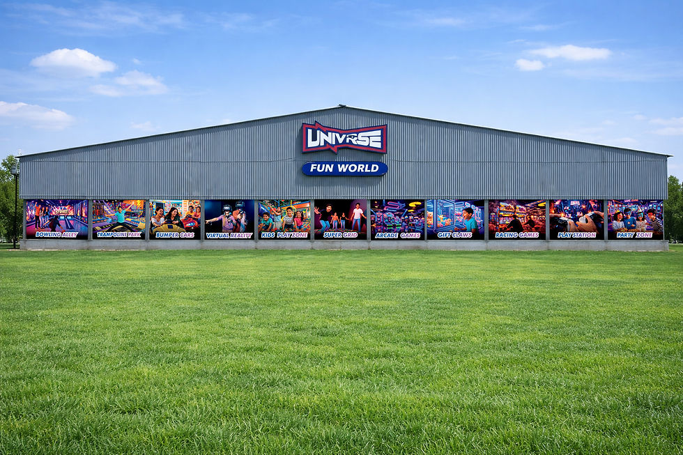
The outdoor structure was designed to establish a strong first impression while maintaining a clean and functional approach. Rather than overcomplicating the form, the focus was on clarity, scale, and presence.
The structure is conceived as a bold, minimal form that reflects the energy of the space within
Clean lines and proportions create a strong visual identity from a distance
The scale of the facade is emphasized to match the large footprint of the game zone
Material and colour are kept subtle externally, allowing the interior experience to remain the highlight
The design ensures visibility and recognizability without relying on excessive elements
Openings and access points are planned for smooth entry and clear movement
The exterior acts as a prelude to the experience inside—simple, controlled, and impactful.
"Designed to be experienced, not just visited.”
--- Krishna Soni, Interior Designer
PROJECT DETAILS
Project: Univrse Game Zone
Location: Malegaon, Maharashtra
Client: Mr. Pushpak Jakhotya
Design: I.D Krishna Soni / P Square Architects

Comments